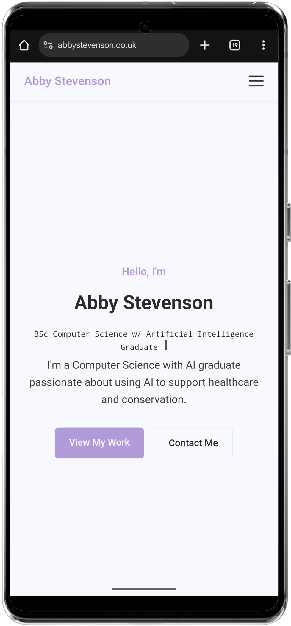
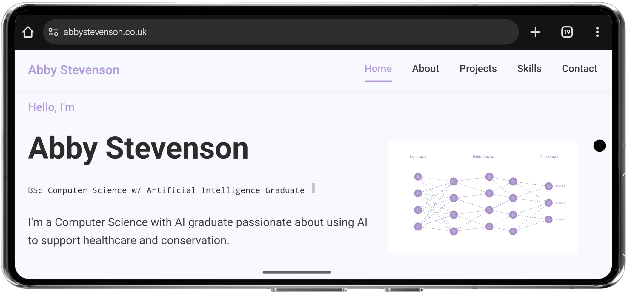
This site is my personal portfolio, a place to share my work, background, and the things I care about in AI and development. I built it to be simple, clean, and something that shows what I can do while remaining approachable and user-friendly.
It's responsive, lightweight, and designed to work smoothly across all devices. I made sure it is accessible and fast, with just enough interactivity like scroll animations and typing effects to make it feel alive without being overwhelming.
Screenshot of the HTML code for my portfolio website in VS Code.
Build a space to show off my projects in a clear, engaging way
Make sure the design feels clean and consistent
Ensure it looks good and works properly on all screen sizes and browsers
Keep everything as fast and smooth as possible
I started by figuring out which sections I needed, like projects, skills, and contact. I planned the layout with simple wireframes and chose a soft purple palette that felt professional but still reflected my style.
The site is built using HTML5, CSS3 with variables for theming, and JavaScript for animations and interactivity. I added typing animations, scroll reveals, and SVG effects to bring some personality into it without slowing anything down.
I used GitHub for version control and set up an automated deployment pipeline using GitHub Actions. Whenever I push to main, the site gets deployed to S3, and the CloudFront cache for any changed files is invalidated automatically so changes go live right away.
I used AWS S3 to host the site and CloudFront as a CDN with HTTPS. I also set up redirects so the www version forwards to the main domain. Cloudflare manages the DNS and adds a bit of extra caching and security.
:root {
--pastel-purple: #b19cd9;
--light-purple: #d8bfd8;
--white: #f8f8ff;
--light-grey: #e6e6fa;
--grey: #3d3d3d;
--dark-grey: #2c2c2c;
}
I used CSS variables to manage colours across the site. It made theming more consistent and a lot easier to tweak as the design evolved.
function typeWriter() {
const text = "BSc Computer Science w/ Artificial Intelligence Graduate";
let i = 0;
const speed = 80; // typing speed in milliseconds
function type() {
if (i < text.length) {
typingText.textContent += text.charAt(i);
i++;
setTimeout(type, speed);
}
}
type();
}
I made a custom typewriter animation for the homepage header to give it a bit more character.
name: Deploy to S3
on:
push:
branches:
- main
jobs:
deploy:
runs-on: ubuntu-latest
steps:
- name: Checkout code
uses: actions/checkout@v3
with:
fetch-depth: 0
- name: Configure AWS credentials
uses: aws-actions/configure-aws-credentials@v2
with:
aws-access-key-id: ${{ secrets.AWS_ACCESS_KEY }}
aws-secret-access-key: ${{ secrets.AWS_SECRET_ACCESS_KEY }}
aws-region: ${{ secrets.AWS_REGION }}
- name: Deploy files to S3
run: |
aws s3 sync . s3://abbystevenson.co.uk --delete --exact-timestamps --exclude ".git/*" --exclude ".github/*"
- name: Get list of changed files
id: changed
run: |
echo "CHANGED_PATHS=$(git diff --name-only ${{ github.event.before }} ${{ github.sha }} | grep -E '\\.html$|\\.css$|\\.js$|\\.png$|\\.jpg$|\\.svg$' | sed 's|^|/|' | tr '\\n' ' ')" >> $GITHUB_ENV
- name: Invalidate changed files in CloudFront
if: env.CHANGED_PATHS != ''
run: |
echo "Invalidating: $CHANGED_PATHS"
aws cloudfront create-invalidation \
--distribution-id ${{ secrets.CLOUDFRONT_DIST_ID }} \
--paths $CHANGED_PATHS
This is the GitHub Actions script I use to automatically deploy and refresh CloudFront when I push updates to the site.
function animateBarWhenVisible(bar) {
const observer = new IntersectionObserver(
(entries, observerInstance) => {
entries.forEach((entry) => {
if (entry.isIntersecting) {
const targetWidth = bar.getAttribute("data-width");
bar.style.width = targetWidth;
bar.classList.add("animated");
observerInstance.unobserve(bar); // only run once
}
});
},
{
threshold: 0.5, // only trigger when 50% in view
}
);
observer.observe(bar);
}
I used the Intersection Observer API to trigger animations when elements scroll into view. It keeps things lightweight and avoids unnecessary work on load.
Challenge: Making sure embedded SVGs worked consistently across different browsers.
Solution: I used the object
tag
to embed the SVGs and accessed their DOM using
contentDocument
. To avoid issues in unsupported
environments, I included checks before applying interactive
effects.
Challenge: Creating a mobile menu that worked well across screen sizes and felt intuitive to use.
Solution: I built a custom hamburger menu that toggles a fullscreen overlay. I made sure touch targets were large enough and added transitions for a smoother feel.
Challenge: Getting everything configured so the www version redirected to the root domain over HTTPS without breaking anything.
Solution: I used S3 static website hosting with redirect rules, added SSL via AWS Certificate Manager, and set up Cloudflare DNS properly to handle the domain forwarding.
I’m really pleased with how the site turned out. Web development has always been a weaker area for me but it’s clean, fast, and works really well. I learned a lot and developed my skills across everything from frontend layout to deployment pipelines, including caching, redirects, and keeping a site lightweight without cutting corners.
There’s more I want to do, maybe integrate dark mode and accessibility enhancements. But for now, it’s doing exactly what I hoped it would.
The full code for the website is available to see on my GitHub, feel free to have a look!
View on GitHub